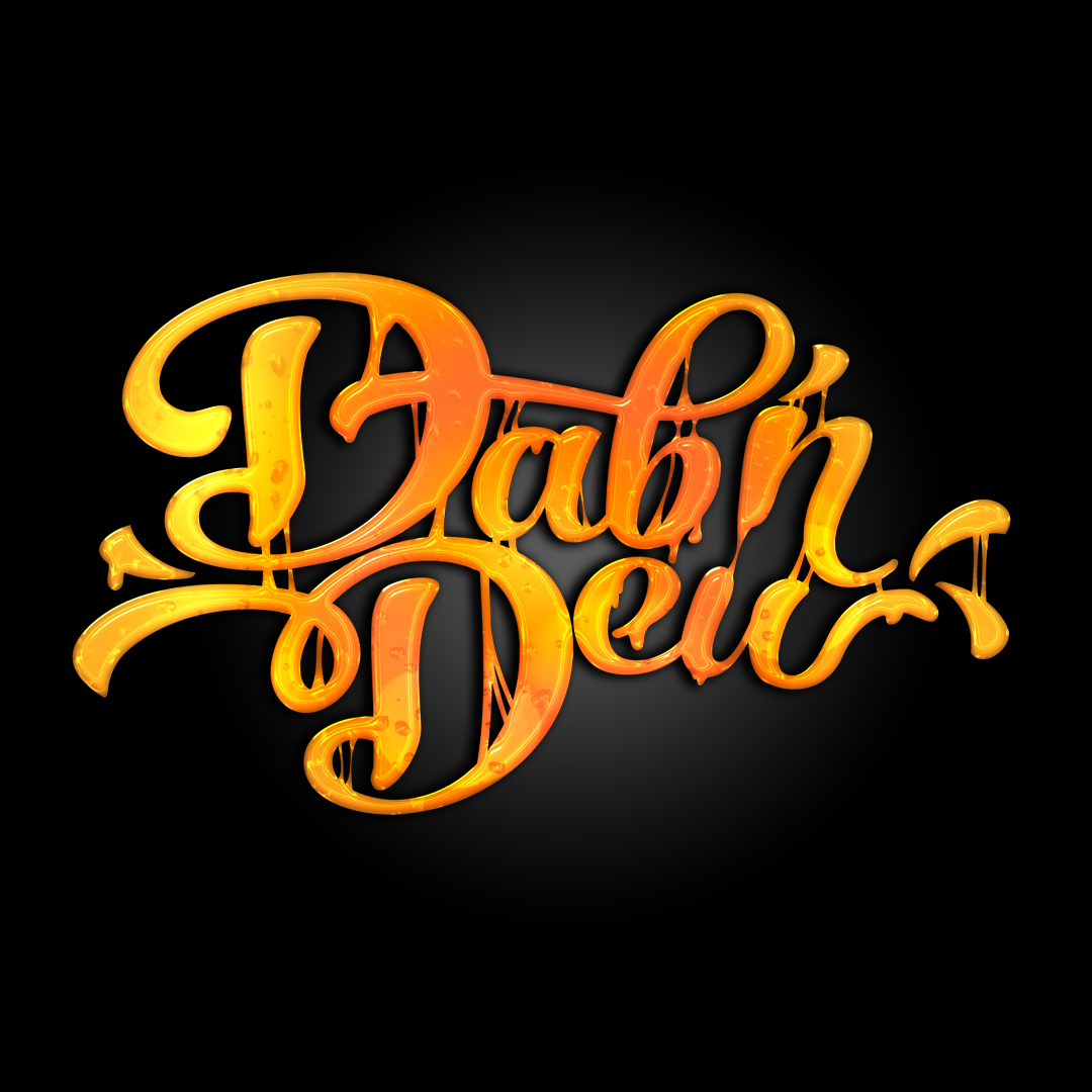
Taking inspiration from Spoon Graphics’ liquified lettering demos, this style of text is to represent the honey-like hues that fresh solventless cannabis concentrates can have. There is some orange added into the gradient to provide a bit of “heat” and contrast to the yellow.
